When used in branding and graphic design, handwriting fonts are often a touchpoint to offer human connection. As a customer, we see the handwritten shapes and feel like there was a human involved in making it, and if we are looking for that human connection, we are drawn in. This works more effectively if the handwriting font used looks realistic, even if it is a digital typeface with no paper and ink in sight. The tools and techniques we use can have a big impact on how effectively a digital typeface can produce the illusion of real handwriting.
Tools For Making Handwriting Fonts
Calligraphr
This web-based app provides a download that you can print or load into a sketching app with little boxes for each letter. You can handwrite each letter in the box and upload it to their site which processes the image and turns it into a font for you. This software offers a free and simple to use option to create a quick font.
The quality of the fonts it creates is okay and it can work for simple writing styles that don’t have a lot of flourishing or connecting strokes. As soon as you introduce complex or energetic writing styles it often starts to fall short.
Fontself
This option is a handy plugin for both Adobe Photoshop and Illustrator which allows the ability to design and export fonts from within those programs. It has more advanced support for things like color fonts and if you are comfortable in those programs already then it’s a good choice.
Glyphs & Other Pro Font Editors
These offer the most control and the biggest learning curve but the results are better. You have full control over letterform shapes, spacing, kerning, ligatures, and other OpenType features. In the rest of the article, I’ll mostly be sharing how and why I use Glyphs for this kind of work.
*Glyphs is Mac Only software, Fontlab is similar professional software that works on Windows, and Robofont is another great Mac option. Also see the list of font editors on Type Design Resources (There are some free ones on here but I have not tried all of them so can’t offer much opinion).
Special Considerations in a Handwriting Font
Bitmap vs Vector
When we handwrite with ink or pencil on paper the resulting image we create often has some kind of texture created by these materials. We can choose to keep this texture or remove it depending on the project needs. If texture is wanted, a bitmap font will need to be created. Bitmap fonts contain a pixel-based image of each letter—this means that this format is not infinitely scalable and is only useable within a certain size range. It also cannot easily change colour without manipulating all of the original images and remaking the font. The Liebe Heide font is an excellent example of how to create a high quality bitmap color font.
Bitmap fonts are uncommon as most fonts use the vector format. In a vector font, each letter is a series of points and handles that can be scaled to any size and changed to any colour easily.
Vector Shapes
There are a few different ways to convert an image made of pixels into vector points and handles. When using Calligraphr or Illustrator the software can auto-trace the image and make a guess at where to place the points and handles. The results from this can vary depending on the quality of your image.
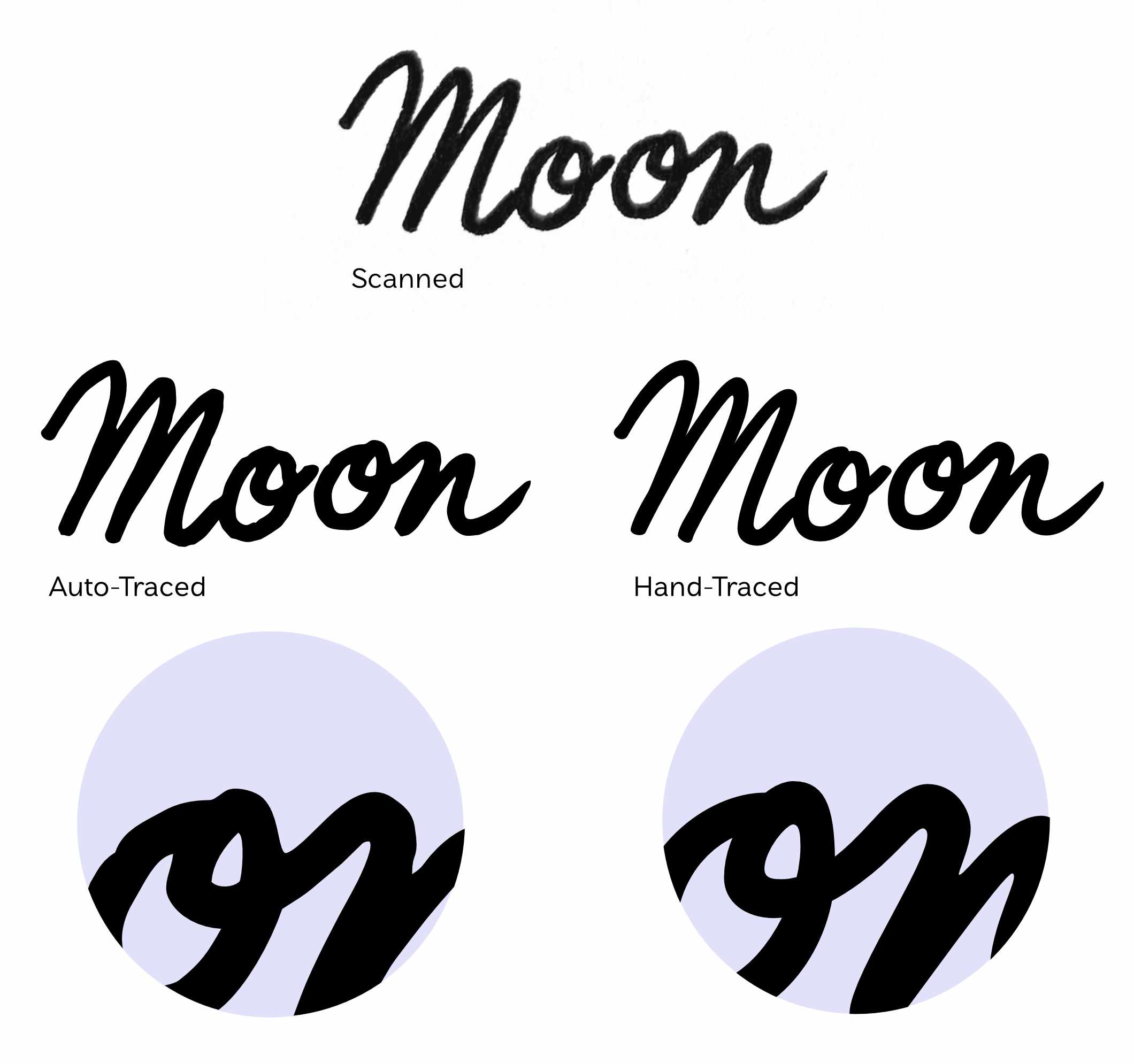
Notice the blobby quality of the auto-trace results? Maybe this is what you are looking for but if we want to stay true to the strokes of the writing instrument auto-trace causes a few issues. First, it feels unnatural as blobs tend to form where strokes cross each other—with a pen we get a sharp transition between two shapes. Second, the point placement makes it very difficult to edit the drawings further, which is a very important step in creating a high quality handwriting font.
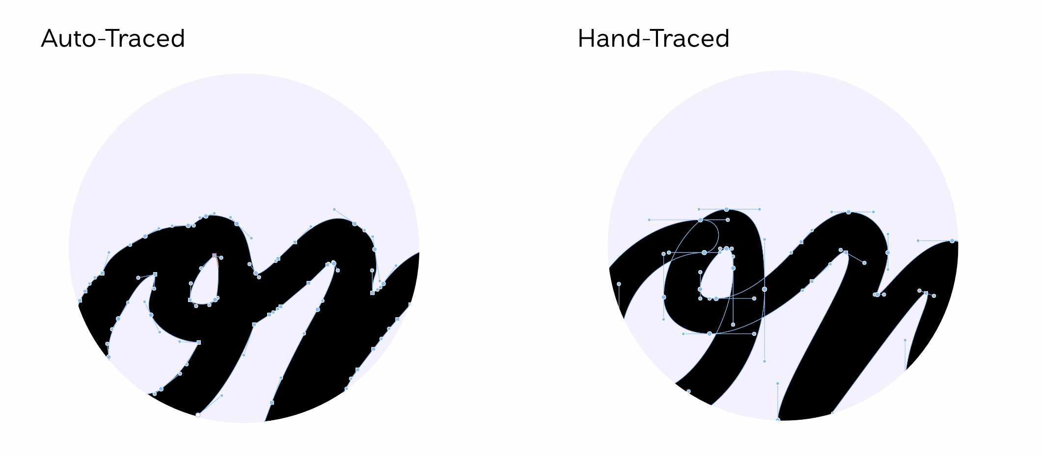
The above shows the point and handle placement of the auto-trace and the hand-trace. There are less points and handles to deal with in the hand-traced version and because the handles are generally set at the extremes of the shape, it is easier to adjust the weight or shape of the letterform. We can hand-trace like this in both Glyphs or Illustrator, but Glyphs has more tools for managing the points and handles and is a lot easier for this kind of work.
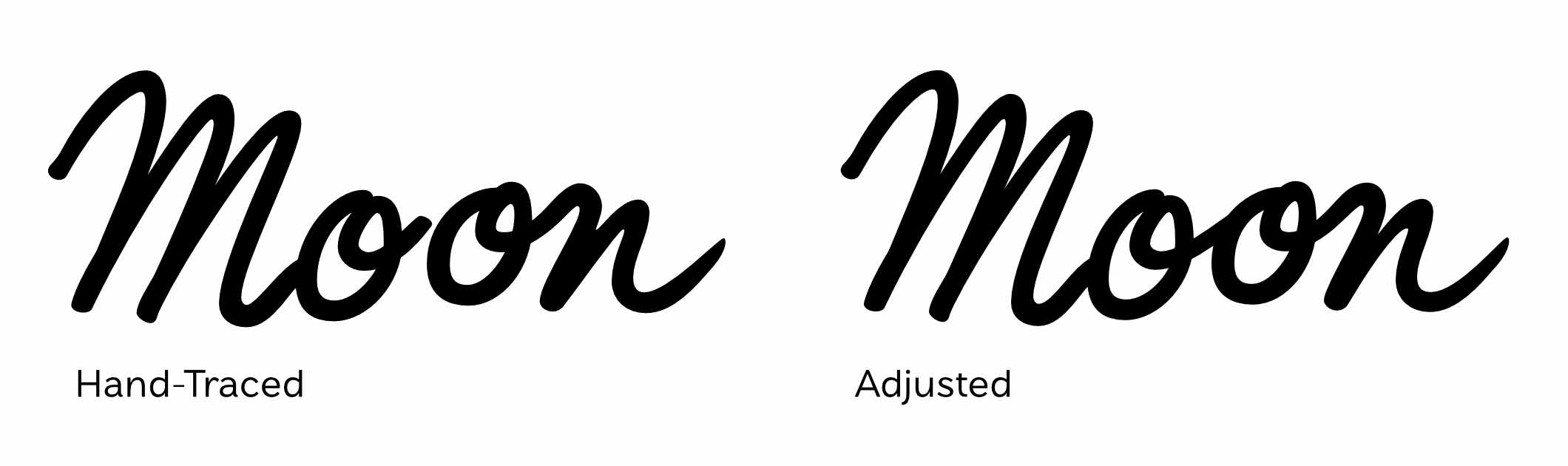
Editing Shapes for Clarity
Creating a handwriting font is a balance of staying true to the original shapes while making something functional. We want to edit the letterforms to be more clear while keeping the character of the original writing. Remember that a font is a system of shapes that can be used interchangeably, that means we need to be conscious of how the shape will interact with the letters coming before and after it. Depending on our sample material, we may also need to adjust weight and size of certain characters, for example, if the sample letters were drawn with different pen thicknesses at different sizes.
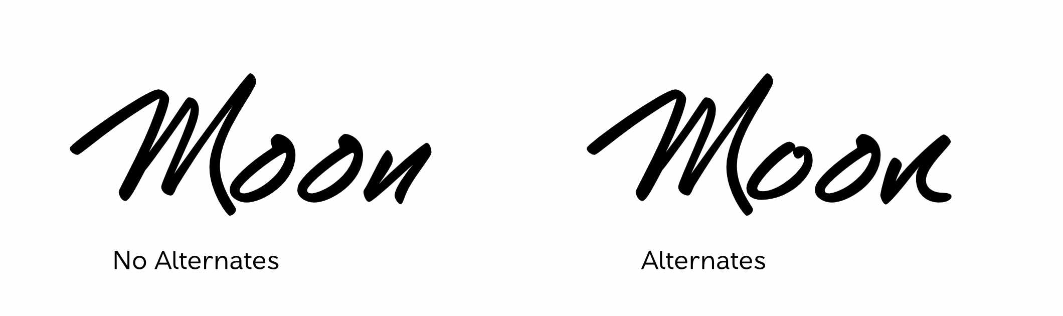
Alternates
Another important feature of realistic handwriting fonts is having alternate versions of letters. Repeating letters that look identical can dissolve the illusion of real handwriting and can make the font feel less dynamic. To enable alternate letters, we can draw an alternate version of each letter (or more than one if you have the time and budget) and then use an OpenType feature called contextual alternates. Contextual alternates will detect whether two of the same letter appear near each other and will swap one with an alternate drawing. This all happens automatically while typing with the font so the final user of the typeface doesn’t need to think about it. Glyphs has a great tutorial on how to build this feature in professional software. Calligraphr and Font Self also offer alternates—see their documentation on how to enable it.
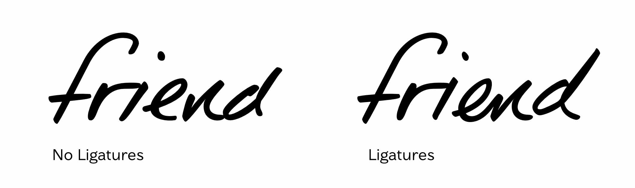
Ligatures
Ligatures can add additional alternate characters that connect with each other. Natural handwriting often has some combinations of letters that will connect or slightly change form when appearing next to each other. Adding these as ligatures can take your font further into the realm of realistic writing and really bring out the quirks of personality from the original samples.
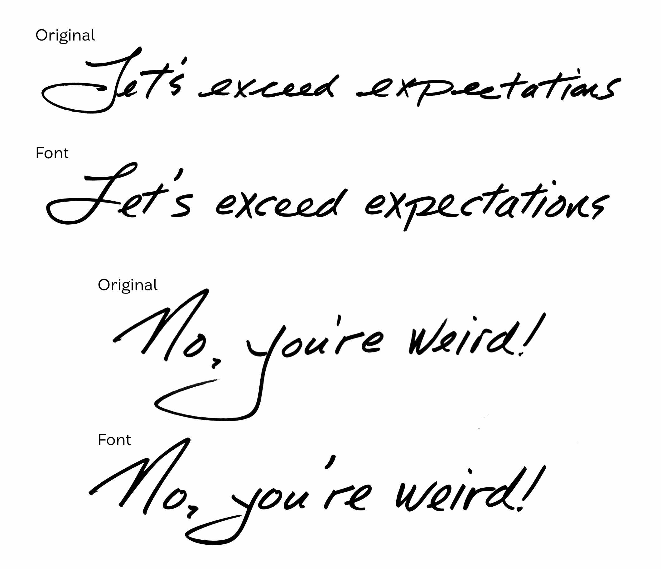
Case Study: Times New Voggin
Times New Voggin is a handwriting font made for John Fluevog Shoes. The handwriting belongs to the longtime owner and footwear designer John Fluevog. John has been the face of the company since the 1980s and his handwriting has been featured in ads, in the retail stores, and on the shoes themselves.
The design team at Fluevog asked John to write out phrases any time they needed them. This meant they had a fairly large collection of samples of his writing from over the years, which is what we used to design the letterforms. I began by searching through the samples for patterns in how letterforms were shaped and looking for clean versions of each letter that I could hand-trace.
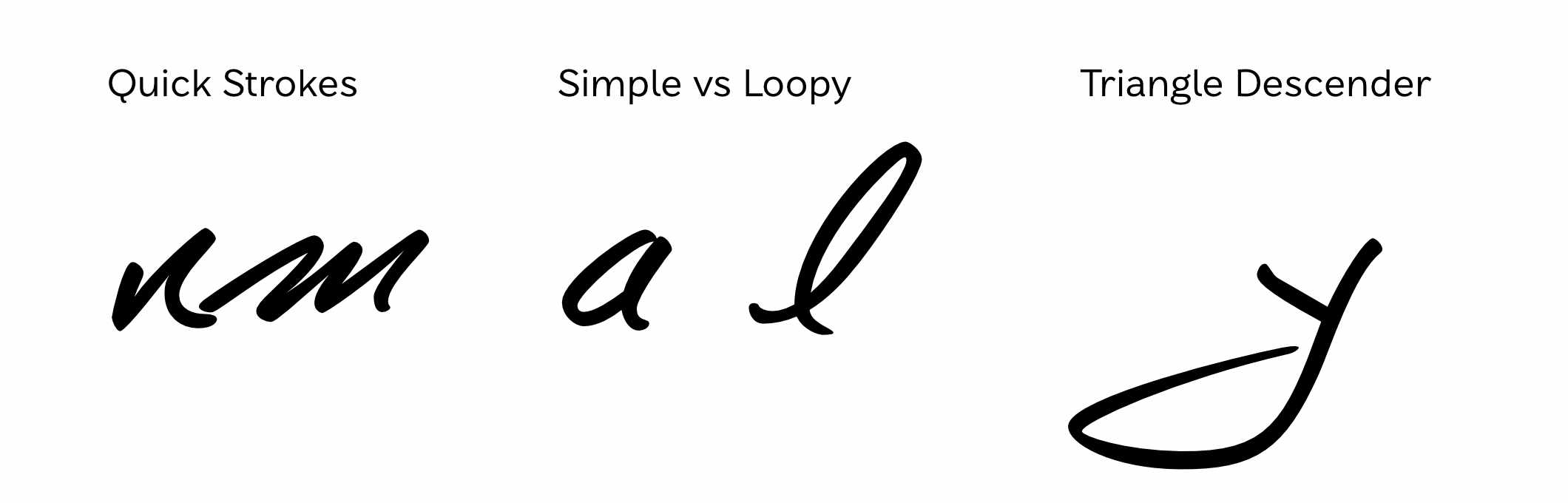
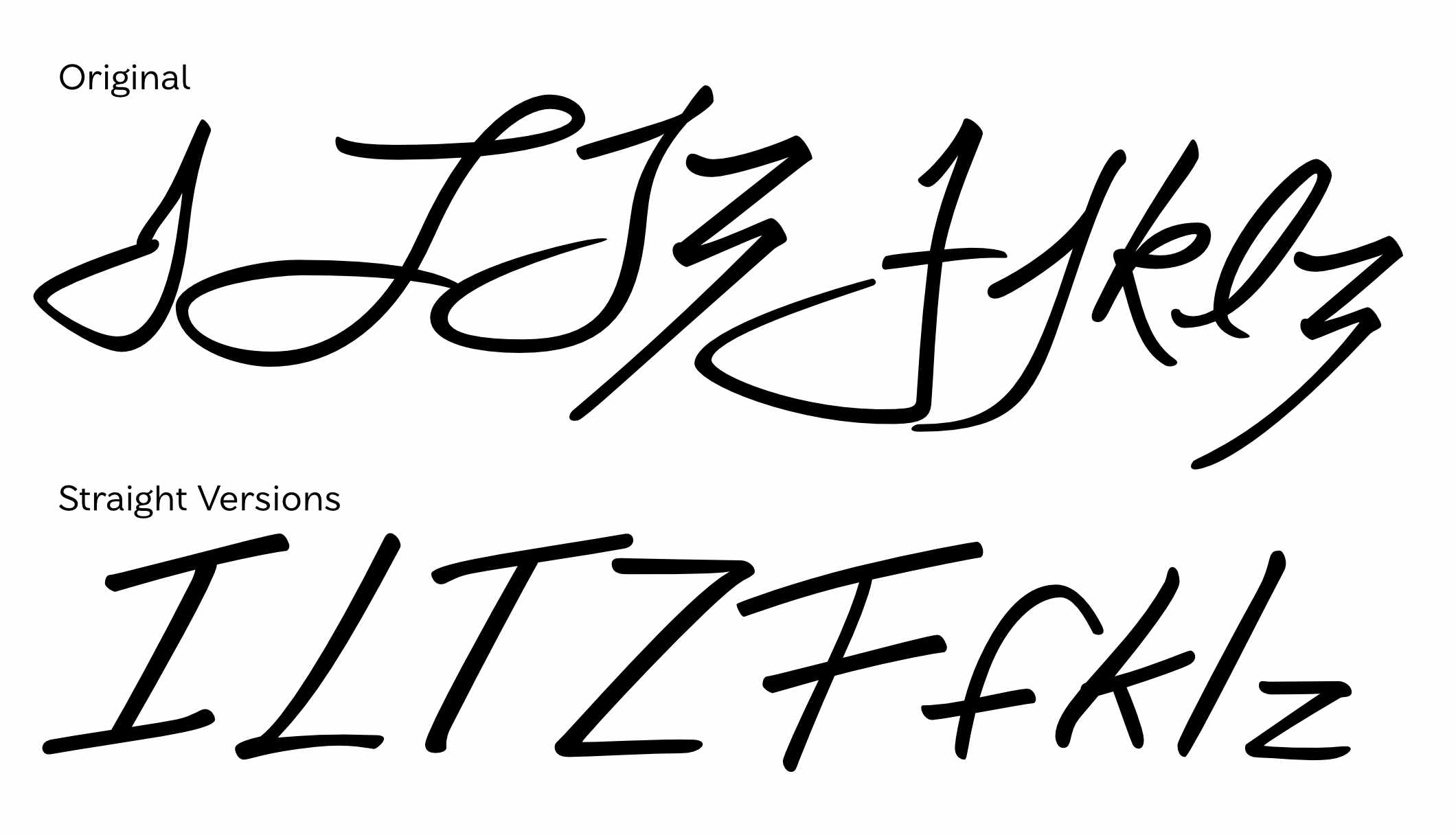
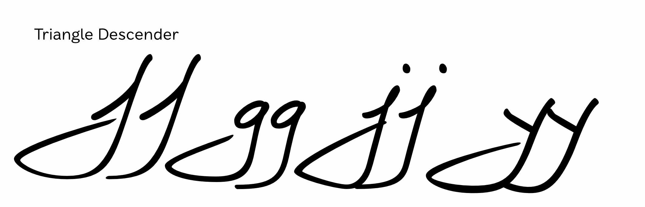
John’s writing features quick pen strokes and a mixture of structure. Some letters are stand-alone and others draw on traditions of connected handwriting featuring loops. Some letters are always formed the same and others change with context. The triangle-shaped descenders are also a huge feature.
We chose the vector format for this typeface because the design team knew it would need to be scaled large for some upcoming projects and we wanted to work with the samples we had rather than ask John to write more. If we had wanted to go the bitmap route, I would have prepared a number of phrases that capture the whole alphabet multiple times and asked for him to write them out a few times using the same pen. This would produce more uniform samples that could be imported and cleaned up in photoshop before compiling them into a font using Glyphs or Fontself. In this process it’s important to get good source material.
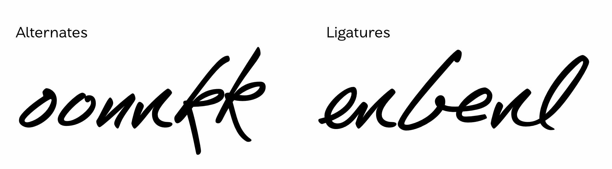
For the features, I made one alternate of each letter and used contextual alternates to randomize them through the text. I also made ligatures of some letters that commonly connected to each other in the samples—this also provides a few more alternate version of some letters.
In some contexts, John would switch some letters to a more straight structure so I provided a stylistic set of these that the designers could choose if they felt it would work better in the context.
And finally, the triangular descenders caused some problems when they collided with each other. To address this, I drew short versions of these descenders and used contextual alternates to replace the second descender character with this short version.
Handwriting fonts will never feel exactly like writing with pen and paper but we can get close. The goal is to capture the unique aspects of the person’s writing and put them on display in the letterforms. It is a balancing act of maintaining authenticity and creating functionality and as a type designer it is a unique and exciting challenge. John’s handwriting is so full of his personality and brand and it was a joy to work with it in this project.